Lesson 1Organizing Data
Let’s find ways to show patterns in data.
Learning Targets:
- I can organize data to see patterns more clearly.
1.1 Notice and Wonder: Messy Data
Here is a table of data. Each row shows two measurements of a triangle.
| length of short side (cm) | length of perimeter (cm) |
|---|---|
| 0.25 | 1 |
| 2 | 7.5 |
| 6.5 | 22 |
| 3 | 9.5 |
| 0.5 | 2 |
| 1.25 | 4.5 |
| 3.5 | 12.5 |
| 1.5 | 5 |
| 4 | 14 |
| 1 | 3.5 |
1.2 Seeing the Data
Here is the table of isosceles right triangle measurements from the warm-up and an empty table.
| length of short sides (cm) | length of perimeter (cm) |
|---|---|
| 0.25 | 1 |
| 2 | 7.5 |
| 6.5 | 22 |
| 3 | 9.5 |
| 0.5 | 2 |
| 1.25 | 4.5 |
| 3.5 | 12.5 |
| 1.5 | 5 |
| 4 | 14 |
| 1 | 3.5 |
| length of short sides (cm) | length of perimeter (cm) |
|---|---|
- How can you organize the measurements from the first table so that any patterns are easier to see? Write the organized measurements in the empty table.
- For each of the following lengths, estimate the perimeter of an isosceles right triangle whose short sides have that length. Explain your reasoning for each triangle.
- length of short sides is 0.75 cm
- length of short sides is 5 cm
- length of short sides is 10 cm
Are you ready for more?
In addition to the graphic representations of data you have learned, there are others that make sense in other situations. Examine the maps showing the results of the elections for United States president for 2012 and 2016. In red are the states where a majority of electorate votes were cast for the Republican nominee. In blue are the states where a majority of the electorate votes were cast for the Democrat nominee.
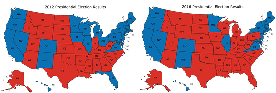
- What information can you see in these maps that would be more difficult to see in a bar graph showing the number of electorate votes for the 2 main candidates?
- Why are these representations appropriate for the data that is shown?
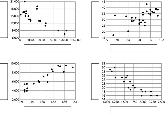
1.3 Tables and Their Scatter Plots
Here are four scatter plots. Your teacher will give you four tables of data.
- Match each table with one of the scatter plots.
- Use information from the tables to label the axes for each scatter plot.
Lesson 1 Summary
Consider the data collected from pulling back a toy car and then letting it go forward. In the first table, the data may not seem to have an obvious pattern. The second table has the same data and shows that both values are increasing together.
Unorganized table
| distance pulled back (in) | distance traveled (in) |
|---|---|
| 6 | 23.57 |
| 4 | 18.48 |
| 10 | 38.66 |
| 8 | 31.12 |
| 2 | 13.86 |
| 1 | 8.95 |
Organized table
| distance pulled back (in) | distance traveled (in) |
|---|---|
| 1 | 8.95 |
| 2 | 13.86 |
| 4 | 18.48 |
| 6 | 23.57 |
| 8 | 31.12 |
| 10 | 38.66 |
A scatter plot of the data makes the pattern clear enough that we can estimate how far the car will travel when it is pulled back 5 inches.
Patterns in data can sometimes become more obvious when reorganized in a table or when represented in scatter plots or other diagrams. If a pattern is observed, it can sometimes be used to make predictions.

Glossary Terms
A scatter plot is a graph that shows the values of two variables on a coordinate plane. It allows us to investigate connections between the two variables.
Each plotted point corresponds to one of 25 dogs. The coordinates of each point tell us the height and weight of that dog.

Lesson 1 Practice Problems
Here is data on the number of cases of whooping cough from 1939 to 1955.
year number of cases 1941 222,202 1950 120,718 1945 133,792 1942 191,383 1953 37,129 1939 103,188 1951 68,687 1948 74,715 1955 62,786 1952 45,030 1940 183,866 1954 60,866 1944 109,873 1946 109,860 1943 191,890 1949 69,479 1947 156,517 - Make a new table that orders the data by year.
- Which years in this period of time had fewer than 100,000 cases of whooping cough?
- Based on this data, would you expect 1956 to have closer to 50,000 cases or closer to 100,000 cases?
In volleyball statistics, a block is recorded when a player deflects the ball hit from the opposing team. Additionally, scorekeepers often keep track of the average number of blocks a player records in a game. Here is part of a table that records the number of blocks and blocks per game for each player in a women’s volleyball tournament. A scatter plot that goes with the table follows.
blocks blocks per game 13 1.18 1 0.17 5 0.42 0 0 0 0 7 0.64 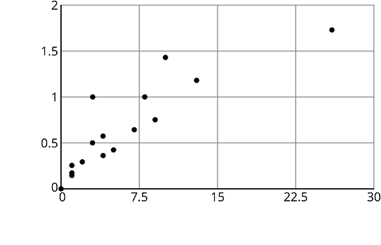
Label the axes of the scatter plot with the necessary information.
A cylinder has a radius of 4 cm and a height of 5 cm.
- What is the volume of the cylinder?
- What is the volume of the cylinder when its radius is tripled?
- What is the volume of the cylinder when its radius is halved?