Lesson 5Describing Trends in Scatter Plots
Let’s look for associations between variables.
Learning Targets:
- I can draw a line to fit data in a scatter plot.
- I can say whether data in a scatter plot has a positive or negative association (or neither).
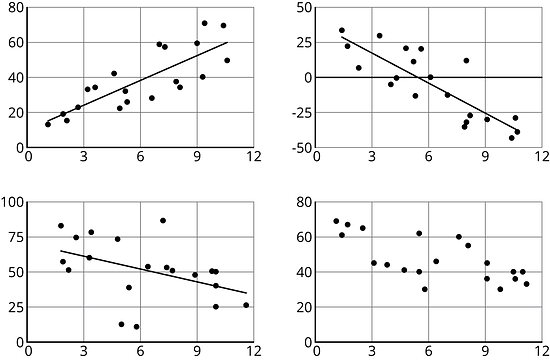
5.1 Which One Doesn’t Belong: Scatter Plots
Which one doesn’t belong?
5.2 Fitting Lines
Experiment with finding lines to fit the data. Drag the points to move the line. You can close the expressions list by clicking on the double arrow.
- Here is a scatter plot. Experiment with different lines to fit the data. Pick the line that you think best fits the data. Compare it with a partner’s.
- Here is a different scatter plot. Experiment with drawing lines to fit the data. Pick the line that you think best fits the data. Compare it with a partner’s.
- In your own words, describe what makes a line fit a data set well.
5.3 Good Fit Bad Fit
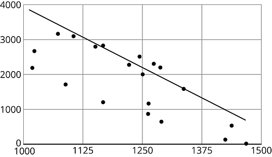
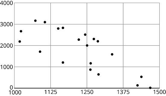
The scatter plots both show the year and price for the same 17 used cars. However, each scatter plot shows a different model for the relationship between year and price.

- Look at Diagram A.
-
For how many cars does the model in Diagram A make a good prediction of its price?
-
For how many cars does the model underestimate the price?
-
For how many cars does it overestimate the price?
-
- Look at Diagram B.
-
For how many cars does the model in Diagram B make a good prediction of its price?
-
For how many cars does the model underestimate the price?
-
For how many cars does it overestimate the price?
-
-
For how many cars does the prediction made by the model in Diagram A differ by more than $3,000? What about the model in Diagram B?
- Which model does a better job of predicting the price of a used car from its year?
5.4 Practice Fitting Lines
- Is this line a good fit for the data? Explain your reasoning.
- Draw a line that fits the data better.
- Is this line a good fit for the data? Explain your reasoning.
- Draw a line that fits the data better.
Are you ready for more?


These scatter plots were created by multiplying the -coordinate by 3 then adding a random number between two values to get the -coordinate. The first scatter plot added a random number between -0.5 and 0.5 to the -coordinate. The second scatter plot added a random number between -2 and 2 to the -coordinate. The third scatter plot added a random number between -10 and 10 to the -coordinate.
- For each scatter plot, draw a line that fits the data.
- Explain why some were easier to do than others.
Lesson 5 Summary
When a linear function fits data well, we say there is a linear association between the variables. For example, the relationship between height and weight for 25 dogs with the linear function whose graph is shown in the scatter plot.

Because the model fits the data well and because the slope of the line is positive, we say that there is a positive association between dog height and dog weight.
What do you think the association between the weight of a car and its fuel efficiency is?

Because the slope of a line that fits the data well is negative, we say that there is a negative association between the fuel efficiency and weight of a car.
Glossary Terms
A negative association is a relationship between two quantities where one tends to decrease as the other increases. In a scatter plot, the data points tend to cluster around a line with negative slope.
Different stores across the country sell a book for different prices.
The scatter plot shows that there is a negative association between the the price of the book in dollars and the number of books sold at that price.

A positive association is a relationship between two quantities where one tends to increase as the other increases. In a scatter plot, the data points tend to cluster around a line with positive slope.
The relationship between height and weight for 25 dogs is shown in the scatter plot. There is a positive association between dog height and dog weight.

Lesson 5 Practice Problems
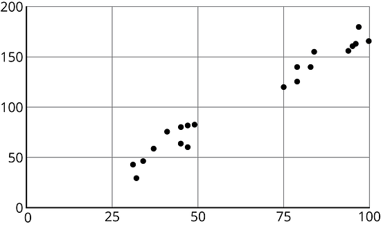
- Draw a line that you think is a good fit for this data. For this data, the inputs are the horizontal values, and the outputs are the vertical values.

- Use your line of fit to estimate what you would expect the output value to be when the input is 10.
- Draw a line that you think is a good fit for this data. For this data, the inputs are the horizontal values, and the outputs are the vertical values.
Here is a scatter plot that shows the most popular videos in a 10-year span.

- Use the scatter plot to estimate the number of views for the most popular video in this 10-year span.
- Estimate when the 4th most popular video was released.
A recipe for bread calls for 1 teaspoon of yeast for every 2 cups of flour.
-
Name two quantities in this situation that are in a functional relationship.
-
Write an equation that represents the function.
-
Draw the graph of the function. Label at least two points with input-output pairs.
-