3.1: Curious about Caps
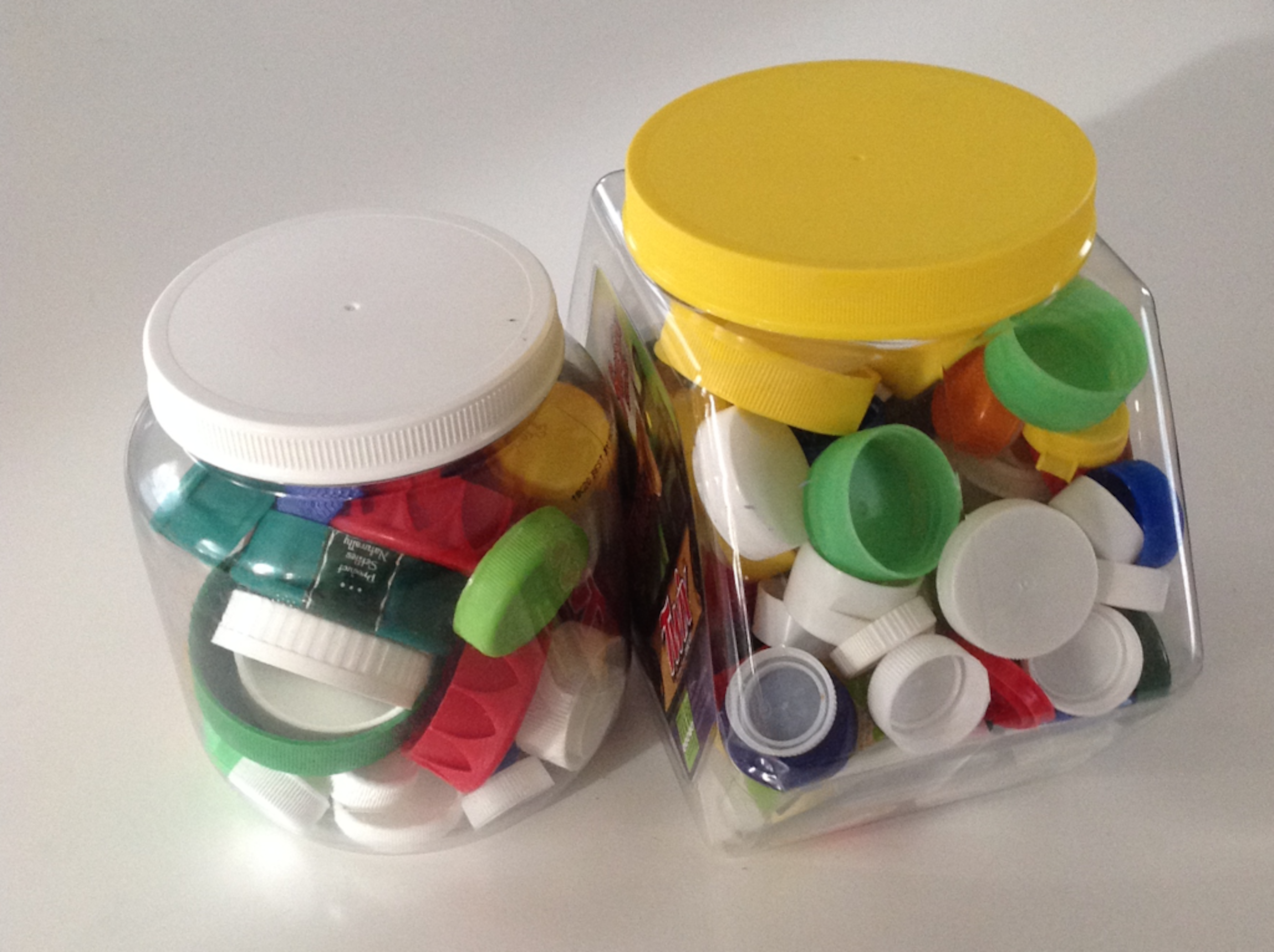
Clare collects bottle caps and keeps them in plastic containers.
Write one statistical question that someone could ask Clare about her collection. Be prepared to explain your reasoning.
Let’s represent data with dot plots and bar graphs.
Clare collects bottle caps and keeps them in plastic containers.
Write one statistical question that someone could ask Clare about her collection. Be prepared to explain your reasoning.
Priya wants to know if basketball players on a men’s team and a women’s team have had prior experience in international competitions. She gathered data on the number of times the players were on a team before 2016.
| men’s team | 3 | 0 | 0 | 0 | 0 | 1 | 0 | 0 | 0 | 0 | 0 | 0 |
|---|---|---|---|---|---|---|---|---|---|---|---|---|
| women’s team | 2 | 3 | 3 | 1 | 0 | 2 | 0 | 1 | 1 | 0 | 3 | 1 |
Organize the information on the two basketball teams into these tables.
Men’s Basketball Team Players
| number of prior competitions | frequency (number) | |
|---|---|---|
| row 1 | 0 | |
| row 2 | 1 | |
| row 3 | 2 | |
| row 4 | 3 | |
| row 5 | 4 |
Women’s Basketball Team Players
| number of prior competitions | frequency (number) | |
|---|---|---|
| row 1 | 0 | |
| row 2 | 1 | |
| row 3 | 2 | |
| row 4 | 3 | |
| row 5 | 4 |
Make a dot plot for each table.
Men’s Basketball Team Players

Women’s Basketball Team Players
Study your dot plots. What do they tell you about the competition participation of:
Combine the data for the players on the men’s and women’s teams and represent it as a single dot plot. What can you say about the repeat participation of the basketball players?
Kiran wants to know which three summer sports are most popular in his class. He surveyed his classmates on their favorite summer sport and collected these responses:
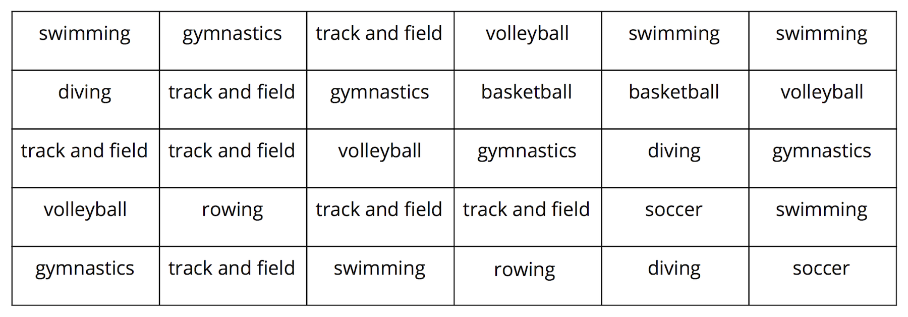
| sport | frequency | |
|---|---|---|
| row 1 | ||
| row 2 | ||
| row 3 | ||
| row 4 | ||
| row 5 | ||
| row 6 | ||
| row 7 | ||
| row 8 |
Represent the information in the table as a bar graph.
When we analyze data, we are often interested in the distribution, which is information that shows all the data values and how often they occur.
In a previous lesson, we saw data about 10 dogs. We can see the distribution of the dog weights in a table such as this one.
| weight in kilograms | frequency | |
|---|---|---|
| row 1 | 6 | 1 |
| row 2 | 7 | 3 |
| row 3 | 10 | 2 |
| row 4 | 32 | 1 |
| row 5 | 35 | 2 |
| row 6 | 36 | 1 |
The term frequency refers to the number of times a data value occurs. In this case, we see that there are three dogs that weigh 7 kilograms, so “3” is the frequency for the value “7 kilograms.”
Recall that dot plots are often used to to represent numerical data. Like a frequency table, a dot plot also shows the distribution of a data set. This dot plot, which you saw in an earlier lesson, shows the distribution of dog weights.

The distribution of categorical data can also be shown in a table. This table shows the distribution of dog breeds.
| breed | frequency | |
|---|---|---|
| row 1 | pug | 9 |
| row 2 | beagle | 9 |
| row 3 | German shepherd | 12 |
We often represent the distribution of categorical data using a bar graph.
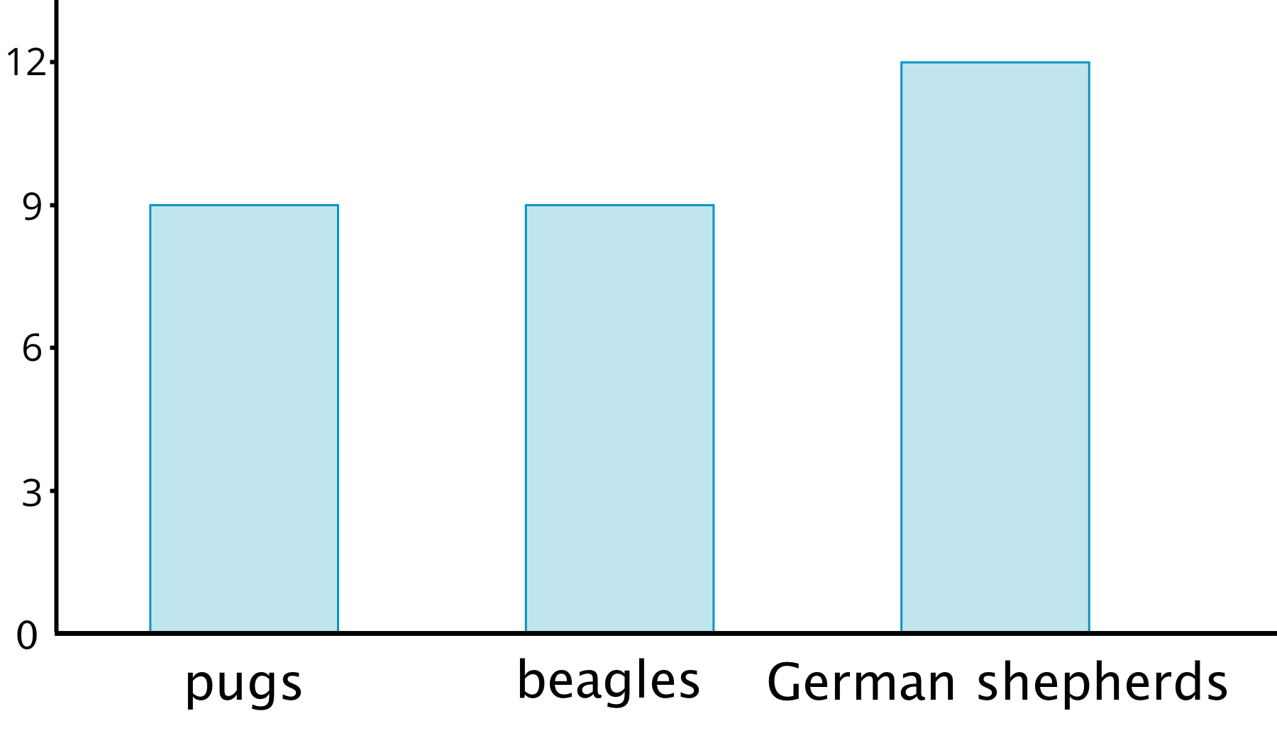
A bar graph also uses a horizontal line. Above it we draw a rectangle (or “bar”) to represent each category in the data set. The height of a bar tells us the frequency of the category. There are four German shepherds in the data set, so the bar for this category is 4 units tall. Below the line we write the labels for the categories.
In a dot plot, a data value is placed according to its position on the number line. A weight of 10 kilograms must be shown as a dot above 10 on the number line.
In a bar graph, however, the categories can be listed in any order. The bar that shows the frequency of pugs can be placed anywhere along the horizontal line.
In statistics, the frequency of a particular data value is the number of times that value occurs in a data set. When that number is expressed as a fraction of the total number of data values, then it is called the relative frequency.
For a numerical or categorical data set, the distribution tells you how many of each value or each category there are in the data set.