Lesson 4: Dot Plots

Let's investigate what dot plots and bar graphs can tell us.

4.1: Pizza Toppings (Part 1)

Fifteen customers in a pizza shop were asked, “How many toppings did you add to your cheese pizza?” Their responses are shown in the table.

1 2 1 3 0 1 1 2 0 3 0 0 1 2 2
  1. Could you use a dot plot to represent the data? Explain your reasoning.
  2. Complete the table.

      number of toppings frequency (number)
    row 1 0  
    row 2 1  
    row 3 2  
    row 4 3  
 

4.2: Pizza Toppings (Part 2)

  1. Use the tables from the warm-up to display the number of toppings as a dot plot. Label your drawing clearly.

    A dot plot with the numbers 0 through 6 indicated.

  2. Use your dot plot to study the distribution for number of toppings. What do you notice about the number of toppings that this group of customers ordered? Write 2–3 sentences summarizing your observations.

4.3: Homework Time

Twenty-five sixth-grade students answered the question: “How many hours do you generally spend on homework each week?”

  1. Why is this question a statistical question?
studying Copyright Owner: English106 License: CC BY 2.0 Via: Flickr
 
  1. This dot plot shows the number of hours per week that these 25 students reported spending on homework.

    Use the dot plot to answer the following questions. For each, show or explain your reasoning.

    1. What percentage of the students reported spending 1 hour on homework each week?
    2. What percentage of the students reported spending 4 or fewer hours on homework each week?
  2. Would 6 hours per week be a good description of the number of hours this group of students spends on homework per week? What about 1 hour per week? Explain your reasoning.
  3. What value do you think would be a good description of the homework time of the students in this group? Explain your reasoning.
  4. Someone said, “In general, these students spend roughly the same number of hours doing homework.” Do you agree? Explain your reasoning.

Summary

We often collect and analyze data because we are interested in learning what is “typical,” or what is common and can be expected in a group.

Sometimes it is easy to tell what a typical member of the group is. For example, we can say that a typical shape in this set is a large circle.

A set that consists of 17 shapes. There are 10 large circles, 1 medium circle, 3 small circles, 1 large square, and 2 small squares.

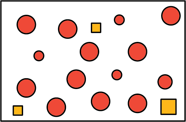
Just looking at the members of a group doesn’t always tell us what is typical, however. For example, if we are interested in the side length typical of squares in this set, it isn’t easy to do so just by studying the set visually.

A set that consists of 18 squares of varying side lengths.

In a situation like this, it is helpful to gather the side lengths of the squares in the set and look at their distribution, as shown in this dot plot.

A dot plot for "side lengths in centimeters". The numbers 1 through 8 are indicated. The data are as follows: 2 centimeters, 4 dots. 3 centimeters, 5 dots. 4 centimeters, 3 dots. 5 centimeters, 3 dots. 6 centimeters, 2 dots. 7 centimeters, 1 dot.

We can see that many of the data points are between 2 and 4, so we could say that side lengths between 2 and 4 centimeters or close to these lengths are typical of squares in this set.

Practice Problems ▶