Lesson 6: Histograms

Let's explore how histograms represent data sets. 

6.1: Dog Show (Part 1)

Here is a dot plot showing the weights, in pounds, of 40 dogs at a dog show.

A dot plot for “weight in pounds.” The numbers 60 through 180, in increments of 10, are indicated. There are tick marks halfway between each indicated number. The data are as follows:  68 pounds, 1 dot. 70 pounds, 1 dot. 72 pounds, 2 dots. 75 pounds, 1 dot. 76 pounds, 1 dot. 82 pounds, 2 dots. 85 pounds, 1 dot. 90 pounds, 4 dots. 93 pounds, 1 dot. 96 pounds, 3 dots. 101 pounds, 4 dots. 106 pounds, 1 dot. 113 pounds, 1 dot. 114 pounds, 5 dots. 119 pounds, 3 dots. 123 pounds, 1 dot. 124 pounds, 2 dots. 137 pounds, 1 dot. 139 pounds, 1 dot. 146 pounds, 1 dot. 153 pounds, 2 dots. 162 pounds, 1 dot.
  1. Write two statistical questions that can be answered using the dot plot.
  2. What would you consider a typical weight for a dog at this dog show? Explain your reasoning.

6.2: Dog Show (Part 2)

Here is a histogram that shows some dog weights in pounds.

A histogram: The horizontal axis is labeled "weight in pounds" and the numbers 60 through 180, in increments of 20, are indicated. On the vertical axis the numbers 0 through 14, in increments of 2, are indicated. The data represented by the bars are as follows: Weight from 60 up to 80, 6. Weight from 80 up to 100, 11. Weight from 100 up to 120 , 14. Weight from 120 up to 140, 5. Weight from 140 up to 160, 3. Weight from 160 up to 180, 1.

Each bar includes the left-end value but not the right-end value. For example, the first bar includes dogs that weigh 60 pounds and 68 pounds but not 80 pounds.

  1. Use the histogram to answer the following questions.

    1. How many dogs weigh at least 100 pounds?

    2. How many dogs weigh exactly 70 pounds?

    3. How many dogs weigh at least 120 and less than 160 pounds?

    4. How much does the heaviest dog at the show weigh?

    5. What would you consider a typical weight for a dog at this dog show? Explain your reasoning.
  2. Discuss with a partner:

    • If you used the dot plot to answer the same five questions you just answered, how would your answers be different?

    • How are the histogram and the dot plot alike? How are they different?

6.3: Population of States

Every ten years, the United States conducts a census, which is an effort to count the entire population. The dot plot shows the population data from the 2010 census for each of the fifty states and the District of Columbia (DC).

A dot plot for “population of states in millions.” The numbers zero through 40, in increments of 2, are indicated. A cluster of approximately 30 data points have a population between zero point 6 zero million people to 6 point 7 2 million people. The remaining approximate data are as follows: 8 million, 1 dot. 8 point 7 5 million, 1 dot. 9 point 5 million, 1 dot. 9 point 7 5 million, 1 dot. 10 million, 1 dot. 11 point 7 5 million, 1 dot. 12 point 5 million, 1 dot. 12 point 7 5 million, 1 dot. 18 point 7 5 million, 1 dot. 19 point 5 million, 1 dot. 25 million, 1 dot. 37 point 5 million, 1 dot.
  1. Here are some statistical questions about the population of the fifty states and DC. How difficult would it be to answer the questions using the dot plot?

    In the middle column, rate each question with an E (easy to answer), H (hard to answer), or I (impossible to answer). Be prepared to explain your reasoning.

    A 3-column table with 6 rows of data. The header for column 1 is labeled "statistical question." The header for coulmn 2 is labeled "using the dot plot." The header for column 3 is labeled "using the histogram." The data in column 2 and 3 are blank. The data for column 1 are as follows: row 1, statistical question, "a. How many states have populations greater than 15 million?"; blank; blank; row 2, statistical question, "b. Which states have populations greater than 15 million?"; blank; blank; row 3, statistical question, "c. How many states have populations less than 5 million?"; blank; blank; row 4, statistical question, "d. What is a typical state population?"; blank; blank; row 5, statistical question, "e. Are there more states with fewer than 5 million people, or more states with between 5 and 10 million people?"; blank; blank; row 6, statistical question, "f. How would you describe the distribution of state populations?". blank; blank.
  2. Here are the population data for all states and the District of Columbia from the 2010 census. Use the information to complete the table.

    A two-column table with 51 rows of data.  Row 1: Alabama, 4 point 7 8; Row 2: Alaska, zero point 7 1; Row 3: Arizona, 6 point 3 9; Row 4: Arkansas, 2 point 9 2; Row 5: California, 37 point 2 5; Row 6: Colorado, 5 point zero 3; Row 7: Connecticut, 3 point 5 7; Row 8: Delaware, zero point 9 zero; Row 9: Distrit of Columbia, zero point 6 zero; Row 10: Florida, 18 point 8 zero; Row 11: Georgia, 9 point 6 9; Row 12: Hawaii, 1 point 3 6; Row 13: Idaho, 1 point 5 7; Row 14: Illinois, 12 point 8 3; Row 15: Indiana, 6 point 4 8; Row 16: Iowa, 3 point zero 5; Row 17: Kansas, 2 point 8 5; Row 18: Kentucky, 4 point 3 4; Row 19: Louisiana, 4 point 5 3; Row 20: Maine, 1 point 3 3; Row 21: Maryland, 5 point 7 7;  Row 22: Massachusetts, 6 point 5 5;  Row 23: Michigan, 9 point 8 8; Row 24:Minnesota, 5 point 3 zero; Row 25: Mississippi, 2 point 9 7; Row 26: Missouri, 5 point 9 9; Row 27: Montana, zero point 9 9; Row 28: Nebraska, 1 point 8 3; Row 29: Nevada, 2 point 7 zero; Row 30: New Hampshire, 1 point 3 2; Row 31: New Jersey, 8 point 7 9; Row 32: New Mexico, 2 point zero 6; Row 33: New York, 19 point 3 8; Row 34: North Carolina, 9 point 5 4; Row 35: North Dakota, zero point 6 7; Row 36: Ohio, 11 point 5 4; Row 37: Oklahoma, 3 point 7 5; Row 38: Oregon, 3 point 8 3; Row 39: Pennsylvania, 12 point 7 zero; Row 40: Rhode Island, 1 point zero 5; Row 41: South Carolina, 4 point 6 3; Row 42: South Dakota, zero point 8 1; Row 43: Tennessee, 6 point 3 5; Row 44: Texas, 25 point 1 5; Row 45: Utah, 2 point 7 6; Row 46: Vermont, zero point 6 3; Row 47: Virgina, 8 point zero zero; Row 48: Washington, 6 point 7 2; Row 49: West Virgina, 1 point 8 5; Row 50: Wisconsin, 5 point 6 9; Row 51: Wyoming, zero point 5 6.
     
      population (millions) frequency
    row 1 0–5  
    row 2 5–10  
    row 3 10–15  
    row 4 15–20  
    row 5 20–25  
    row 6 25–30  
    row 7 30–35  
    row 8 35–40  
  3. Use the grid and the information in your table to create a histogram.

    A blank grid: The horizontal axis is labeled “population of states in millions” and has the numbers 0 through 40, in increments of 5, indicated. The vertical axis has the numbers 0 through 30, in increments of 2, indicated and there are tick marks midway between each indicated number.
  4. Return to the statistical questions at the beginning of the activity. Which ones are now easier to answer?

    In the last column of the table, rate each question with an E (easy), H (hard), and I (impossible) based on how difficult it is to answer them. Be prepared to explain your reasoning.

Summary

In addition to using dot plots, we can also represent distributions of numerical data using histograms.

Here is a dot plot that shows the weights, in kilograms, of 30 dogs, followed by a histogram that shows the same distribution. 

A dotplot and histogram for dog weights in kilograms. For the dot plot, the numbers 10 through 35, in increments of 5, are indicated. The 30 data values are as follows: 10 kilograms, 1 dot. 11 kilograms, 1 dot. 12 kilograms, 2 dots. 13 kilograms, 1 dot. 15 kilograms, 1 dot. 16 kilograms, 2 dots. 17 kilograms, 1 dot. 18 kilograms, 2 dots. 19 kilograms, 1 dot. 20 kilograms, 3 dots. 21 kilograms, 1 dot. 22 kilograms, 3 dots. 23 kilograms, 1 dot. 24 kilograms, 2 dots. 26 kilograms, 2 dots. 28 kilograms, 1 dot. 30 kilograms, 1 dot. 32 kilograms, 2 dots. 34 kilograms, 1 dot. 35 kilograms, 1 dot.  For the histogram, the horizontal axis is labeled “dog weights in kilograms” and the numbers 10 through 35, in increments of 5, are indicated. On the vertical axis the numbers 0 through 10, in increments of 2, are indicated. The data represented by the bars are as follows: Weight from 10 up to 15, 5. Weight from 15 up to 20, 7. Weight from 20 up to 25, 10. Weight from 25 up to 30, 3. Weight from 30 up to 35, 5.

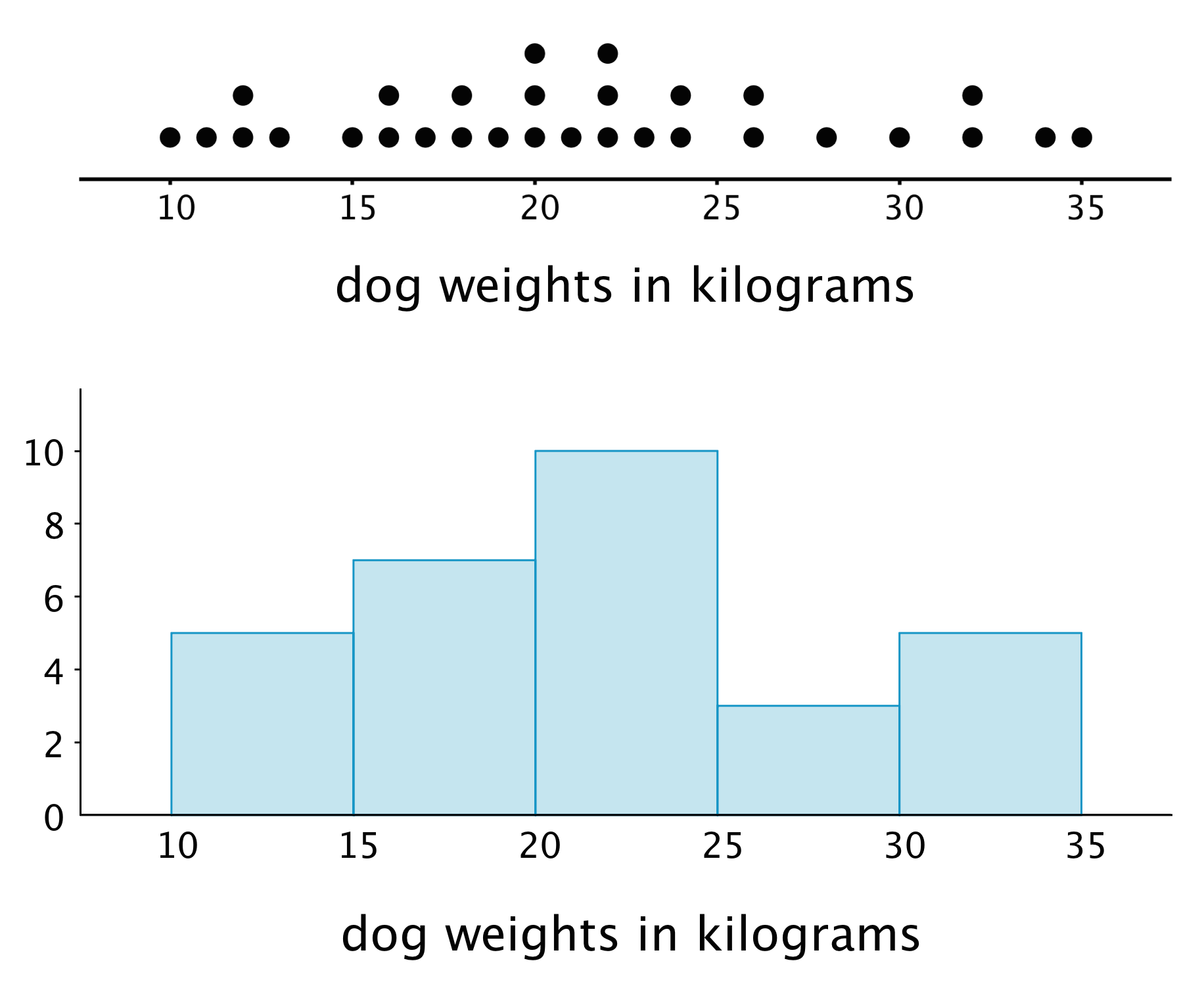
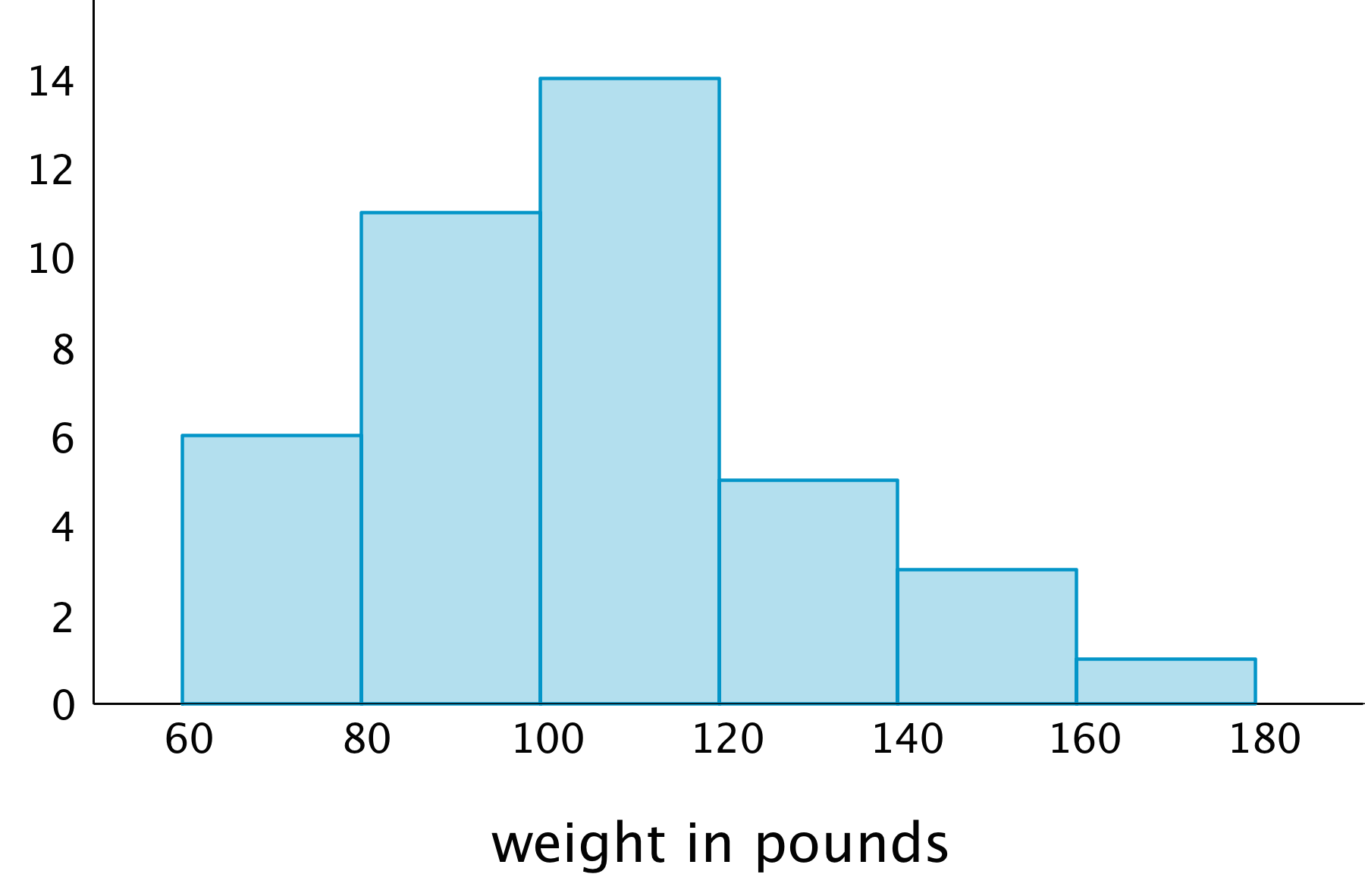
In a histogram, data values are placed in groups or “bins” of a certain size, and each group is represented with a bar. The height of the bar tells us the frequency for that group.

For example, the height of the tallest bar is 10, and the bar represents weights from 20 to less than 25 kilograms, so there are 10 dogs whose weights fall in that group. Similarly, there are 3 dogs that weigh anywhere from 25 to less than 30 kilograms.

Notice that the histogram and the dot plot have a similar shape. The dot plot has the advantage of showing all of the data values, but the histogram is easier to draw and to interpret when there are a lot of values or when the values are all different.

Here is a dot plot showing the weight distribution of 40 dogs. The weights were measured to the nearest 0.1 kilogram instead of the nearest kilogram.

A dot plot for “dog weights in kilograms”. The numbers 8 through 36, in increments of 2, are indicated. The approximate data are as follows:  10 kilograms, 1 dot. 10.75 kilograms, 1 dot. 11.25 kilograms, 1 dot. 11.75 kilograms, 1 dot. 12 kilograms, 1 dot. 13 kilograms, 1 dot. 14.75 kilograms, 1 dot. 15 kilograms, 1 dot. 16 kilograms, 1 dot. 16.5 kilograms, 1 dot. 17 kilograms, 1 dot. 18 kilograms, 1 dot. 18.5 kilograms, 1 dot. 18.75 kilograms, 1 dot. 19 kilograms, 1 dot. 19.25 kilograms, 1 dot. 20 kilograms, 1 dot. 20.25 kilograms, 1 dot. 20.5 kilograms, 1 dot. 21 kilograms, 1 dot. 21.5 kilograms, 1 dot. 22.5 kilograms, 1 dot. 22.75 kilograms, 1 dot. 23 kilograms, 1 dot. 23.25 kilograms, 1 dot. 23.5 kilograms, 1 dot. 24 kilograms, 1 dot. 24.75 kilograms, 1 dot. 25.75 kilograms, 1 dot. 26 kilograms, 1 dot. 26.5 kilograms, 1 dot. 28 kilograms, 1 dot. 28.25 kilograms, 1 dot. 30 kilograms, 1 dot. 31.5 kilograms, 1 dot. 31.75 kilograms, 1 dot. 32 kilograms, 1 dot. 33.5 kilograms, 1 dot. 34 kilograms, 1 dot. 35 kilograms, 1 dot.

Here is a histogram showing the same distribution.

A histogram: The horizontal axis is labeled “dog weights in kilograms” and the numbers 10 through 35, in increments of 5, are indicated. On the vertical axis the numbers 0 through 12, in increments of 2, are indicated. The data represented by the bars are as follows:   Weight from 10 up to 15, 7. Weight from 15 up to 20, 9. Weight from 20 up to 25, 12. Weight from 25 up to 30, 5. Weight from 30 up to 35, 7.

In this case, it is difficult to make sense of the distribution from the dot plot because the dots are so close together and all in one line. The histogram of the same data set does a much better job showing the distribution of weights, even though we can’t see the individual data values.

Practice Problems ▶

Glossary

histogram

histogram

A histogram is a way of representing a numerical data set by grouping the data into bins and showing how many values are in each bin with a vertical bar.