Lesson 8: Describing Distributions on Histograms

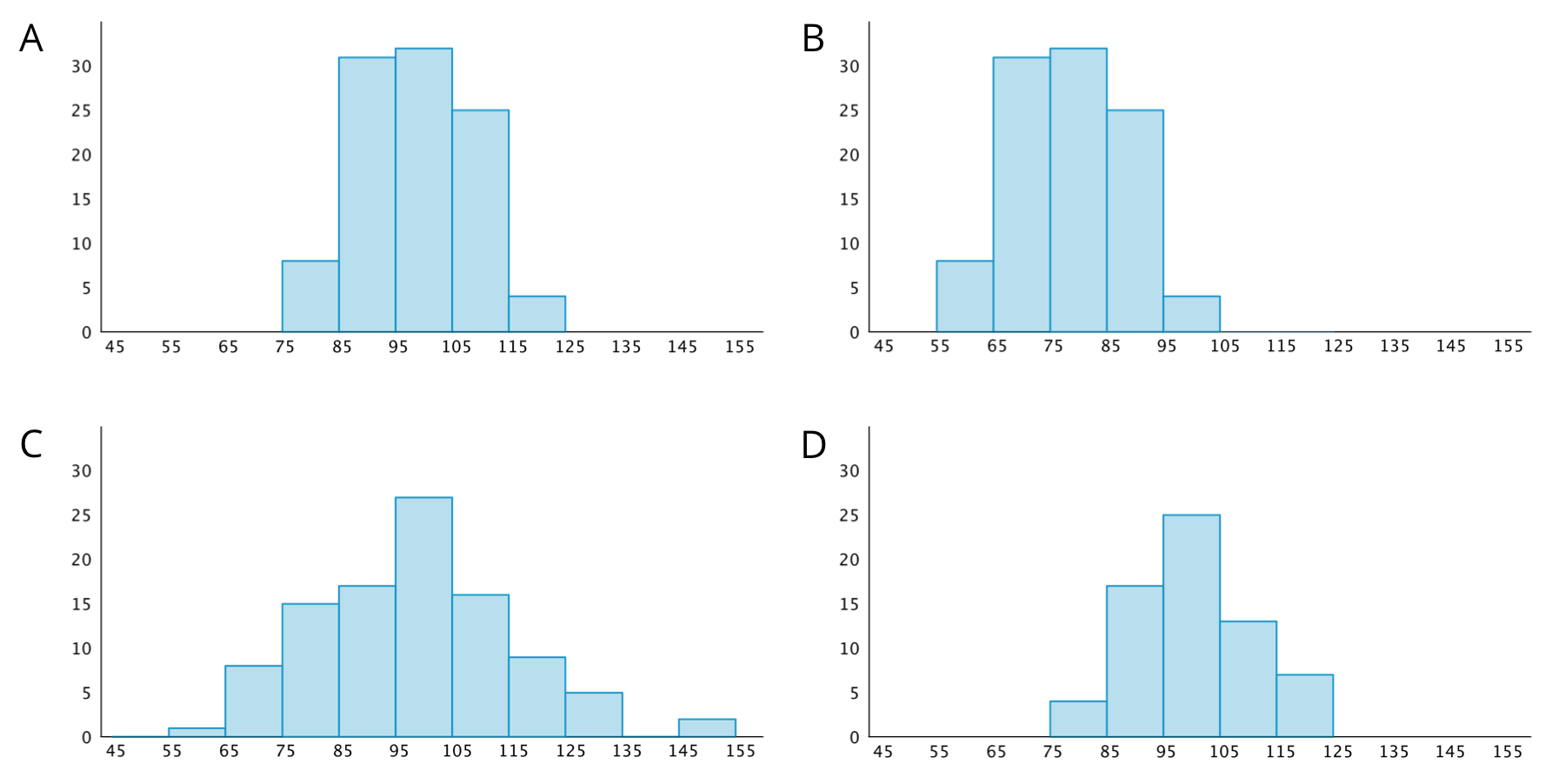
Let's describe distributions displayed in histograms.

8.1: Which One Doesn’t Belong: Histograms

Which histogram does not belong? Be prepared to explain your reasoning.

Four histograms, labeled A, B, C, and D: Each histogram has a horizontal axis with the numbers 45 through 155, in increments of 10, indicated. Each histogram has a vertical axis with the numbers 0 through 30, in increments of 5, indicated.  The data represented by the bars in histogram A are as follows:  Length from 45 up to 55, 0. Length from 55 up to 65, 0. Length from 65 up to 75, 0. Length from 75 up to 85, 7. Length from 85 up to 95, 30. Length from 95 up to 105, 31. Length from 105 up to 115, 25. Length from 115 up to 125, 3. Length from 125 to 135, 0. Length from 135 to 145, 0. Length from 145 to 155, 0.  The data represented by the bars in histogram B are as follows:  Length from 45 up to 55, 0. Length from 55 up to 65, 7. Length from 65 up to 75, 30. Length from 75 up to 85, 31. Length from 85 up to 95, 25. Length from 95 up to 105, 3. Length from 105 up to 115, 0. Length from 115 up to 125, 0. Length from 125 to 135, 0. Length from 135 to 145, 0. Length from 145 to 155, 0.  The data represented by the bars in histogram C are as follows:  Length from 45 up to 55, 0. Length from 55 up to 65, 1. Length from 65 up to 75, 7. Length from 75 up to 85,15. Length from 85 up to 95, 17. Length from 95 up to 105, 26. Length from 105 up to 115, 16. Length from 115 up to 125, 8. Length from 125 to 135, 5. Length from 135 to 145, 0. Length from 145 to 155, 2.  The data represented by the bars in histogram D are as follows:  Length from 45 up to 55, 0. Length from 55 up to 65, 0. Length from 65 up to 75, 0. Length from 75 up to 85,4. Length from 85 up to 95, 16. Length from 95 up to 105, 25. Length from 105 up to 115, 13. Length from 115 up to 125, 6. Length from 125 to 135, 0. Length from 135 to 145, 0. Length from 145 to 155, 0.

8.2: Sorting Histograms

  1. Your teacher will give your group a set of histogram cards. Sort them into two piles—one for histograms that are approximately symmetrical, and another for those that are not.
  2. Discuss your sorting decisions with another group. Do both groups agree which cards should go in each pile? If not, discuss the reasons behind the differences and see if you can reach agreement. Record your final decisions.

    • Histograms that are approximately symmetrical:

    • Histograms that are not approximately symmetrical:

  3. Histograms are also described by how many major peaks they have. Histogram A is an example of a distribution with a single peak that is not symmetrical.

    Which other histograms have this feature?

  4. Some histograms have a gap, a space between two bars where there are no data points. For example, if some students in a class have 7 or more siblings, but the rest of the students have 0, 1, or 2 siblings, the histogram for this data set would show gaps between the bars because no students have 3, 4, 5, or 6 siblings.

    Which histograms do you think show one or more gaps?

  5. Sometimes there are a few data points in a data set that are far from the center. Histogram A is an example of a distribution with this feature.

    Would you describe any of the other histograms as having this feature? If so, which ones?

8.3: Getting to School

Your teacher will provide the data that your class collected on how students travel to school and their travel times.

  1. Use the data to draw a histogram that shows your class’s travel times.
    A blank histogram: The horizontal axis is labeled “travel time in minutes” and the numbers 0 through 75, in increments of 5, are indicated. The vertical axis has 30 horizontal gridlines indicated.
  2. Write a couple of sentences to describe the distribution of travel times. Comment on the center and spread of the data, as well as the shape and features.
  3. Use the data on methods of travel to draw a graph. Include labels for the horizontal axis.
    A blank grid with 40 horizontal units and 21 vertical units.
  4. Write 2–3 sentences to describe what you learned about your class’s methods of transportation to school. Comment on any patterns you noticed.
  5. Compare the histogram and the bar graph that you drew. Discuss your thinking with your partner:

    • How are they alike?
    • How are they different?

Summary

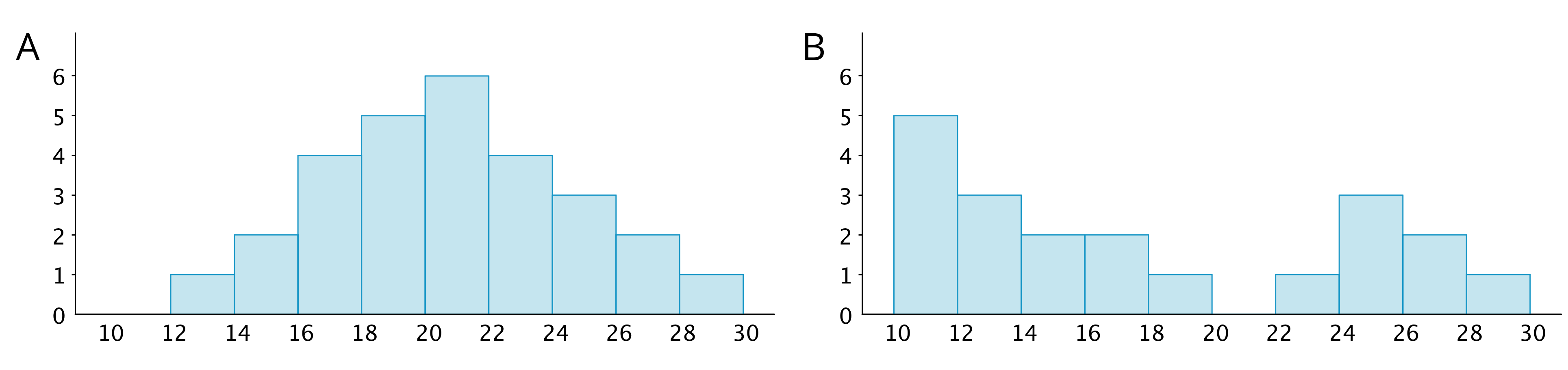
We can describe the shape and features of the distribution shown on a histogram. Here are two distributions with very different shapes and features.

Two histograms, labeled “A” and “B” where the horizontal axis has the numbers 10 through 30, in increments of 2, indicated and on the vertical axis, the numbers 0 through 6 are indicated. The data represented by the bars on histogram “A” are: 10 up to 12, 0; 12 up to 14, 1; 14 up to 16, 2, 16 up to 18, 4; 18 up to 20, 5; 20 up to 22, 6; 22 up to 24, 4, 24 up to 26, 3; 26 up to 28, 2; 28 up to 30, 1. The data represented by the bars on histogram “B” are: 10 up to 12, 5; 12 up to 14, 3; 14 up to 16, 2; 16 up to 18, 2; 18 up to 20, 1; 20 up to 22, 0; 22 up to 24, 1; 24 up to 26, 3; 26 up to 28, 2; 28 up to 30, 1.
  • Histogram A is very symmetrical and has a peak near 21. Histogram B is not symmetrical and has two peaks, one near 11 and one near 25.
  • Histogram B has two clusters. A cluster forms when many data points are near a particular value (or a neighborhood of values) on a number line.
  • Histogram B also has a gap between 20 and 22. A gap shows a location with no data values.

Here is a bar graph showing the breeds of 30 dogs and a histogram for their weights.

A bar graph and a histogram. The bar graph has three categories on the horizontal axis labeled "pugs," "beagles," and "German shepherds." The vertical axis has the numbers 0 through 12, in increments of 3, indicated. The bar labeled “pugs” has a height of 9. The bar labeled “beagles” has a height of 9” and the bar labeled “German shepherds” has a height of 12. The histogram has a horizontal axis labeled “dog weights in kilograms.” The vertical axis has the numbers 0 through 10, in increments of 2, indicated. The data represented by the bars are as follows: 10 up to 15 kilograms, 5; 15 up to 20 kilograms, 7; 20 up to 25 kilograms, 10; 25 up to 30 kilograms, 3; 30 up to 35 kilograms, 5.

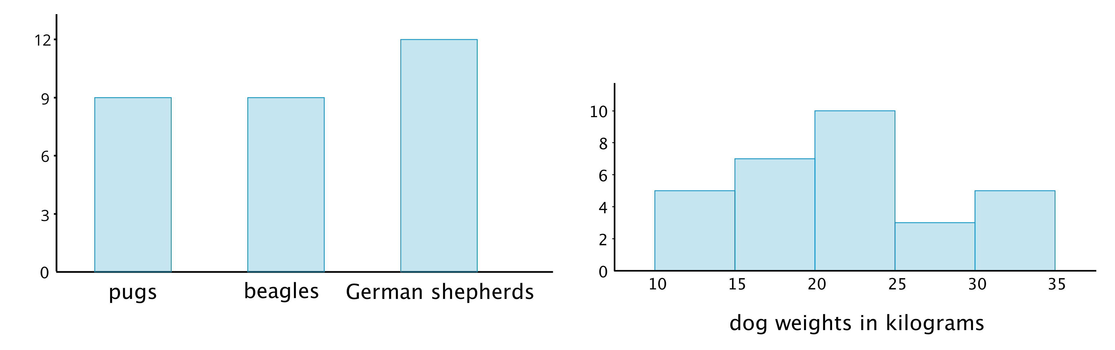
Bar graphs and histograms may seem alike, but they are very different.

  • Bar graphs represent categorical data. Histograms represent numerical data. 
  • Bar graphs have spaces between the bars. Histograms show a space between bars only when no data values fall between the bars.
  • Bars in a bar graph can be in any order. Histograms must be in numerical order.
  • In a bar graph, the number of bars depends on the number of categories. In a histogram, we choose how many bars to use.

Practice Problems ▶